Something interesting happened in the world of online luxury shopping this year. If you’ve been browsing high-end stores lately, you’ve probably noticed it—everything’s gotten darker. And we’re not talking about a gloomy vibe. We’re talking about sophisticated, elegant darkness that makes products pop like never before.
Dark mode has quietly become the secret weapon of premium brands in 2026, and there’s solid reasoning behind it that goes way beyond just looking cool.
Why Does Dark Actually Feel More Luxurious?
Think about where you usually see luxury items in real life. High-end jewelry stores use black velvet displays. Luxury car showrooms keep lighting dramatic and moody. Even the packaging for premium products tends toward blacks, deep blues, and rich charcoals.
There’s psychology at work here. When you visit a website with a dark background, your eyes naturally focus on the illuminated elements—namely, the products. It’s like every item gets its own spotlight. That diamond necklace that looked ordinary on a white background? Put it against deep black, and suddenly it’s the star of the show.
I’ve seen Shopify stores completely transform their conversion rates just by switching to a well-executed dark theme. One jewelry brand reported that customers were spending 40% longer on product pages after the switch. Why? Because it’s simply easier and more pleasant to look at.
The Eye Strain Factor Nobody Talks About
Here’s something we all deal with but rarely discuss: we’re all staring at screens way too much. In 2026, the average person is looking at digital devices for over seven hours a day. That’s a lot of blue light hitting your retinas.
Dark interfaces cut down on that harsh light emission significantly. This isn’t just about comfort—it’s about respecting your customers’ health. And people notice. They might not consciously think “wow, this dark website is easier on my eyes,” but subconsciously, they’ll stay longer and come back more often.
Plus, dark mode saves phone battery life. Your customers browsing at night appreciate not watching their battery drain while shopping. It’s one of those small details that premium brands get right.
Making Your Products Absolutely Shine
This is where dark mode really earns its place. Colors look richer against darkness. Metals gleam brighter. White products get this almost ethereal glow. It’s not magic—it’s just how human vision works.
I’ve watched brands photograph the same product twice—once for a bright background, once for dark—and the difference is remarkable. Against darkness, textures become more apparent. That leather bag suddenly looks more tactile. The weave of that cashmere sweater tells a story.
For product categories where quality and craftsmanship matter—watches, jewelry, designer furniture, premium electronics—dark backgrounds are game-changers. Your products deserve to be seen at their best, and darkness provides that stage.
The Shopify Reality in 2026
Now, let’s talk about actually implementing this on Shopify. Sure, there are plenty of apps out there promising easy dark mode functionality. But here’s the catch—most of them come with monthly fees, can slow down your site, and often conflict with other customizations you’ve made.
I’ve seen stores paying $200-500 monthly just for various apps to achieve the look and functionality they want. That adds up fast, especially when you’re trying to build a sustainable business.
This is exactly why solutions like endschema.com exist. Instead of renting features through apps, you own the actual code. Their Liquid-based sections and custom code integrate directly into your Shopify theme—no external dependencies, no recurring fees, no performance hits from bloated app code.
Build Your Perfect Dark Mode Store with 50+ Ready-to-Use Sections
Speaking of endschema.com, if you’re serious about implementing a premium dark aesthetic on Shopify, their complete library is worth checking out. They offer 50+ high-performance Liquid sections specifically engineered for stores that want professional results without the app bloat.
What makes this particularly relevant for dark mode implementation? Several of their sections are specifically designed with dark aesthetics in mind:
Dark-Optimized Product Displays – Their product showcase sections include variants pre-configured for dark backgrounds, with proper contrast ratios and image treatments that make your products glow against darkness.
Native Star Ratings for Dark Themes – Display aggregate ratings with color schemes that work beautifully on dark backgrounds, without the heavy external scripts that typical review apps load.
Dynamic Shipping Estimators – Show precise delivery dates using native Liquid logic, styled to maintain that premium dark aesthetic throughout the checkout journey.
Custom Product Tables – Interactive comparison tables that are actually readable on dark backgrounds—something surprisingly hard to find in most app-based solutions.
Schema Markup Ready – Every section includes proper JSON-LD structured data, ensuring your dark-themed store doesn’t sacrifice SEO performance for aesthetics.
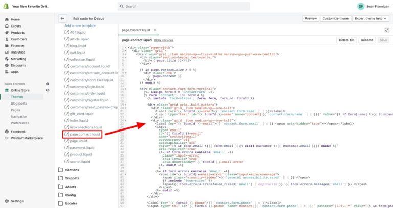
Here’s what really sets their approach apart: every section is written in clean Liquid code that lives in your theme. You paste it once into a Custom Liquid block, and it becomes a native part of your Shopify store. No monthly subscriptions eating into your margins. No external JavaScript slowing down your Core Web Vitals scores.
For stores implementing dark mode in 2026, this means you can have sophisticated features like animated cart goals showing free shipping progress, dynamic payment information displays, and interactive size guides—all styled consistently with your dark aesthetic and loading at 0ms execution time.
The complete package is available for a one-time payment of €107 (currently on sale for just €5 + VAT), giving you lifetime access to all 50+ sections plus any future updates. Compare that to paying $30-50 monthly for individual apps that do one thing each, and the value becomes obvious.
Getting Dark Mode Right (Because It’s Easy to Get Wrong)
Here’s where many stores mess up: they think dark mode is just inverting colors. It’s not. Pure black backgrounds with pure white text? That’s actually hard on the eyes—almost as bad as bright white screens.
Good dark design uses near-blacks. Think deep charcoal, midnight blue, or rich brown-blacks. Your text shouldn’t be pure white either—slightly warm grays work much better. This creates enough contrast to read easily without that harsh glare.
Colors behave differently on dark backgrounds too. That vibrant red that looked great on white might look neon and cheap against black. You’ll usually want to dial down color saturation by 10-15% for dark contexts.
And don’t forget about depth. Flat dark designs feel oppressive, like you’re staring into a void. Smart brands use subtle shadows and gradients to create layers and guide visitors through the page naturally.
The sections from endschema.com handle these nuances automatically. Their dark-optimized components already account for proper contrast ratios, color temperature adjustments, and depth layering—so you don’t have to figure it out through trial and error.
The Mobile Advantage
Most of your customers are shopping on their phones in 2026, and dark interfaces are perfect for mobile. Better battery life, comfortable viewing in bed at night, less screen glare in dark environments—these benefits matter to people.
Because endschema.com sections are built with native Liquid rather than heavy JavaScript frameworks, they perform exceptionally well on mobile devices. The code is lightweight, loads instantly, and doesn’t drain battery like app-based solutions tend to do.
Does Dark Mode Actually Increase Sales?
The question everyone wants answered: does this actually improve conversions?
From what I’ve seen, well-executed dark aesthetics consistently deliver results. Eye-tracking studies show visitors spend about 35% more time examining products on dark-themed stores. More time looking means more informed buying decisions—and fewer returns later.
Your call-to-action buttons get more attention too. A golden “Add to Cart” button on black demands to be clicked. But you need balance—too much contrast feels jarring and breaks that premium atmosphere you’ve carefully built.
One thing to watch: trust signals like security badges and payment icons need careful handling in dark themes. They need enough contrast to be credible without looking out of place.
Why Owning Your Code Matters
Let me be blunt about something: Shopify apps are essentially renting features. You’re paying monthly for functionality you never truly own. If the app developer shuts down, updates break things, or decides to triple their prices, you’re stuck.
Custom Liquid code is different. It’s yours. When you invest in quality code from sources like endschema.com, you’re building equity in your store. You can modify it, adapt it as trends evolve, and never worry about recurring costs or external dependencies.
This philosophy aligns perfectly with premium branding. Real luxury brands don’t cut corners or rely on temporary solutions. They invest in quality and own their assets—your code should be no different.
The endschema.com team understands this. Their documentation is comprehensive, their code is commented and readable, and if you ever need help implementing a section, they provide direct assistance. You’re not just buying code—you’re investing in a foundation for your store’s long-term success.
The Bottom Line
Dark mode in 2026 isn’t a trend—it’s a strategic choice that premium brands are making for good reasons. It reduces eye strain, makes products look incredible, creates memorable brand identities, and when done right, improves conversion rates.
If you’re running a Shopify store and want to position yourself in the premium market, implementing sophisticated dark aesthetics is worth serious consideration. Just do it right. Skip the expensive apps with recurring fees and performance issues.
Invest in clean, native Liquid code that gives you complete control. The 50+ section library from endschema.com offers exactly this approach—professional components built for merchants who understand that true ownership of your digital presence means owning the code that powers it.
Your customers are spending real money on your products. They deserve a shopping experience that respects their eyes, showcases your products beautifully, and loads fast on their devices. Dark mode, implemented properly with the right tools, delivers all of that.
And in a crowded e-commerce landscape, that kind of thoughtful design makes all the difference.
Ready to transform your Shopify store with premium dark aesthetics? Explore the complete EndSchema library at endschema.com and stop paying monthly for features you should own.